Making medical product text legible
Medical products have text (groundbreaking news, right?). From labels on devices, to results on a screen, to IFUs, there is a lot of text to consider when designing medical devices and software. However, the text frequently isn’t given much thought.
People need to be able to both see and recognize characters and words to read them. Legibility refers to how clear and decipherable those characters and words are. Readability is also very important, and is a topic we’ll cover in a future post.
Here are four design decisions that impact legibility:
1. Typeface
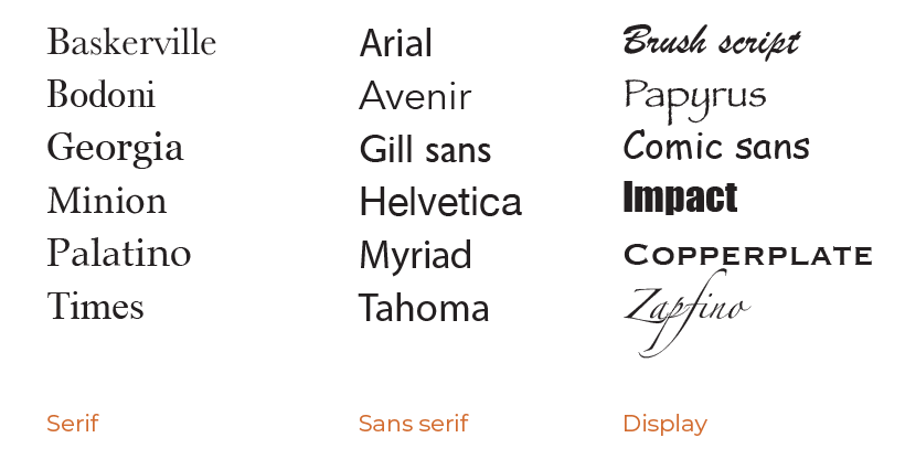
There are hundreds of thousands of typefaces (fonts) in the world. When selecting one for your project, consider it’s category:
- Serif – has small lines or “feet” at the ends of the letters which help move the eye along in sentences, and the strokes have thick and thin areas making letter shapes easy to recognize. Serif fonts are good for printed blocks of text, like IFUs or books.
- Sans serif – is made of simple lines with a consistent stroke. Sans serif fonts are good for short labels on devices and on screens where they are easier to render in pixels.
- Display – these are decorative and stylized. Display fonts are good for advertising or for a birthday card for your aunt, but we don’t recommend them for medical products.
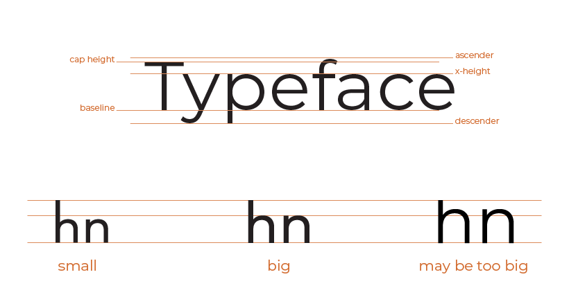
After you’ve decided on serif or sans serif, next look at the x-height. That is the height of the lowercase letters (like x, hence the name) compared to the uppercase letters. Fonts with larger x-heights are clearer, especially when reading quickly or skimming. But don’t go so large that it is hard to distinguish letters.
2. Size
Not all sizes are equal. All the fonts below are set to the same size, do they look the same to you?
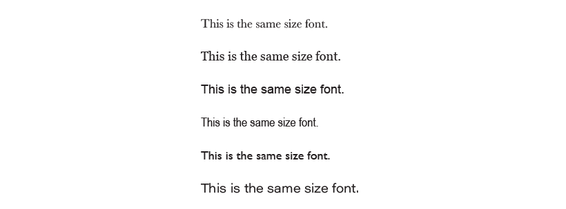
One font set to 16 points may have a different perceived size than another. This can be due to the x-height we discussed above, how tall the ascenders and descenders are, the weight of the font (how bold it is), or even the company that created the font. Since you can’t rely solely on the number on the screen, try a few sizes and fonts and compare them.
When thinking about size, the most important thing is understanding the context your user is in. Are they reading on a phone, a desktop computer, a patient monitor across the room, or a jumbotron? The same size does not work for all!
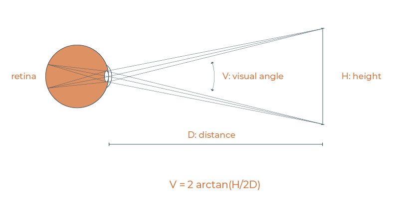
If you want to be technical, you can measure the visual angle. That’s the size an image occupies on your retina. Find a visual angle calculator online and enter the height of the letters and the distance from the eye. The preferred angle for reading English text is 20 to 22 minutes of arc.
If you want to be less technical, look at your design on the same device and the same distance that your end users will be. Can you read it? Can your grandpa?
3. Contrast
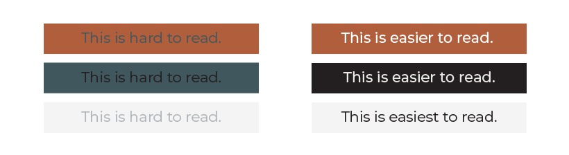
Contrast is the difference between the lightness/darkness of the text and the background (paper or screen). Dark text on a light background is usually the easiest to read. Light text on a dark background can be almost as easy to read, although it helps to make the font a bit more bold.
Don’t use light on light, dark on dark, or medium on medium.
The Web Content Accessibility Guidelines (WCAG) recommend a contrast ratio of 3:1 for large text and 4.5:1 for regular text to help users with visual disabilities perceive text. We recommend using the same rules for everyone.
There are many online tools to help you check color contrasts. Here’s one our User Experience Designer likes to use: https://accessible-colors.com/
For more information, see our post on Accessible Contrast.
4. Letter Case
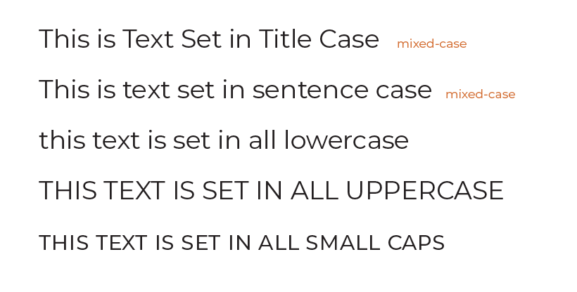
People are used to reading words with mixed-cases. Because we have so much familiarity and practice with mixed-case, it is easier for us to scan and read them than all uppercase letters (or all lowercase, or small caps). Also, ALL UPPERCASE LETTERS FEELS LIKE YELLING.
The two most common types of mixed case are title case and sentence case:
- Title case – the first letter of each word is capitalized, or the first letter of each major word is capitalize, and minor words are not (the, a, is)
- Sentence case – The first letter of the sentence is capitalized.
We recommend using title case for short, important information, such as headings and buttons. Use sentence case for longer information, like instructions.
Final Thoughts
These seem like four simple design decisions, yet they come together to create text that is either legible or not. Well designed text is part of a well designed medical product. And well-designed medical products help people to live longer and better. A poorly-designed product, on the other hand, can harm or kill.
Contact us to learn how our user experience experts can assist with the design of your medical devices to ensure they are user-friendly and safe.