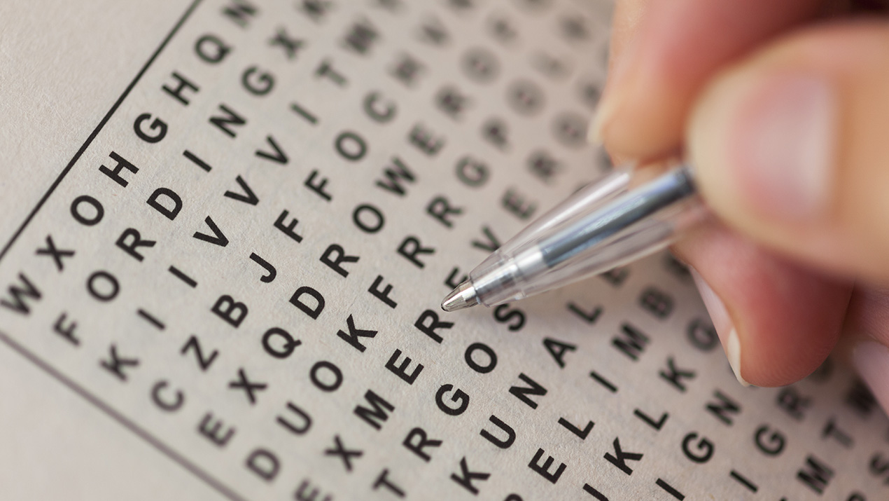
Visual search and user interface design are completely intertwined. Visual search and object detection concern not only our human visual system searching through an area of space (i.e., a screen), but also locating the desired object in a reasonable amount of time. Think about a classic word search activity. Scanning through a sea of 500 letters in order to find 12 words hidden among them may not be too complicated, but that doesn’t mean cognition isn’t taxed.
Designing an interface that’s too busy or cluttered creates a similar experience for users. The basic idea is the same: the user must sort through unnecessary, irrelevant crap in order to solve a problem, answer a question, or complete a task. Users have absolutely no hope of utilizing a function if they have trouble finding it in the first place.
As human factors experts, it’s our job to make the products we work on as far from a word search as humanly possible. If a user’s search for specific information lasts more than a few short seconds, we’ve already failed!
What are some tactics to ensure visual search is a smooth process? How can we help the user find the information he/she is looking for, and, in turn, provide an efficient, easy-to-use medical device for everyone? Here are three design basics to keep visual search and detection as efficient as possible.
Conspicuity
Conspicuity is how elements stand out from their surroundings. Targets that are frequently used or important should be more conspicuous than potential distractors in an interface. By making those targets more distinct, the elements most important to the user are easier to find.
There are several ways to make something easier to detect:
Bolding, italicizing, or underlining specific words or phrases are the most common methods for emphasizing text specifically. They bring attention to what you want but are subtle enough to avoid distracting the user. If you want to step it up a notch, include color. By changing the font color or background color, where those elements are becomes clearer. Size, of course, has an analogous effect.
Things get really out of hand when movement is incorporated somehow; in an environment of mostly static elements, something that moves or changes in some dynamic way will really pop out at the user. It’s so effective, however, it distracts users if they try to focus on something else on the page. Anyone remember these?

The same concepts can be applied to anything in an interface, not just text. A critical button, perhaps, could be a different color. You could enlarge it or add a bolded outline for further emphasis.
It’s important to know when to decrease conspicuity as well. Targets that are not important to the user should produce as little ‘noise’ as possible. An irrelevant item that is highly conspicuous will be the opposite of helpful for your users. When users click rarely-needed buttons, move them to the side or bottom of the interface. Designing elements to aesthetically match their surroundings is also a good way to make them stand out less.
Declutter the interface design
All sorts of signal/noise problems are associated with a cluttered interface. Each ‘nontarget’ has the potential to distract the user from what he or she is targeting because each item must be scanned to conclude that it is not the desired target. Therefore, the more items there are in the search area (an instruction manual, perhaps), the longer it could take the user to find the target.
In order to alleviate the negative effects of cluttered interfaces, design with a minimalist attitude. Even in the face of added capabilities or features, including only the most essential will serve the user well from a usability perspective. There is no need to offer anything further than what is required to use the product effectively.
Don’t be afraid to utilize white space in order to give users some room to breathe. It won’t be too empty or boring; users will appreciate the simplicity. Likewise, you don’t need a billion colors or textures to make a design pretty. A scheme of three or four colors will do the trick.
Lastly, decrease the word count. Ensure users only have to read what is absolutely necessary to get the job done. That may mean a fifteen-word statement gets condensed into a five-word phrase. As long as it conveys the same message, do it.
Appeal to the user’s expectations
Deviating from design norms can really throw people off. Use what people are accustomed to as an advantage. There are innumerable ways to make something unique; creating a new home page symbol shouldn’t be one of them.
There are two ways you can go about determining where users expect a feature to be located: ask them and observe their behavior!
Asking users where they expect certain operations to be located is hilariously obvious, but hey, it works. Nearly always, the user will have a rough location in mind. Deviating from those expectations can be a source of poor usability.
When observing behavior, it’s possible to discern the user’s expectation based on where they look first. Whether it’s scrolling to the top of the page, navigating to a completely different screen, or staying right where they are, the user’s interaction behavior gives us an idea of where they were expecting the target to be.
In order to get the finer detail, eye tracking is a phenomenal option. Proper analysis of footage can yield illuminating data that you just can’t get any other way. We find that as users look around the interface during their search, fixation periods in their gaze patterns identify where they expect something to be.
Optimizing Interface Design
Word searches may be an entertainment tool for long flights and car rides, but spending time searching for a target is bad for medical device usability. Rather, users want their tasks to be completed as quickly and efficiently as possible. By decluttering the interface, increasing the conspicuity of important elements, and appealing to users’ expectations, we can decrease the amount of time users search for their target, and enable successful interactions between product and user.
Contact us to learn more about how we can help you create a usable product.


