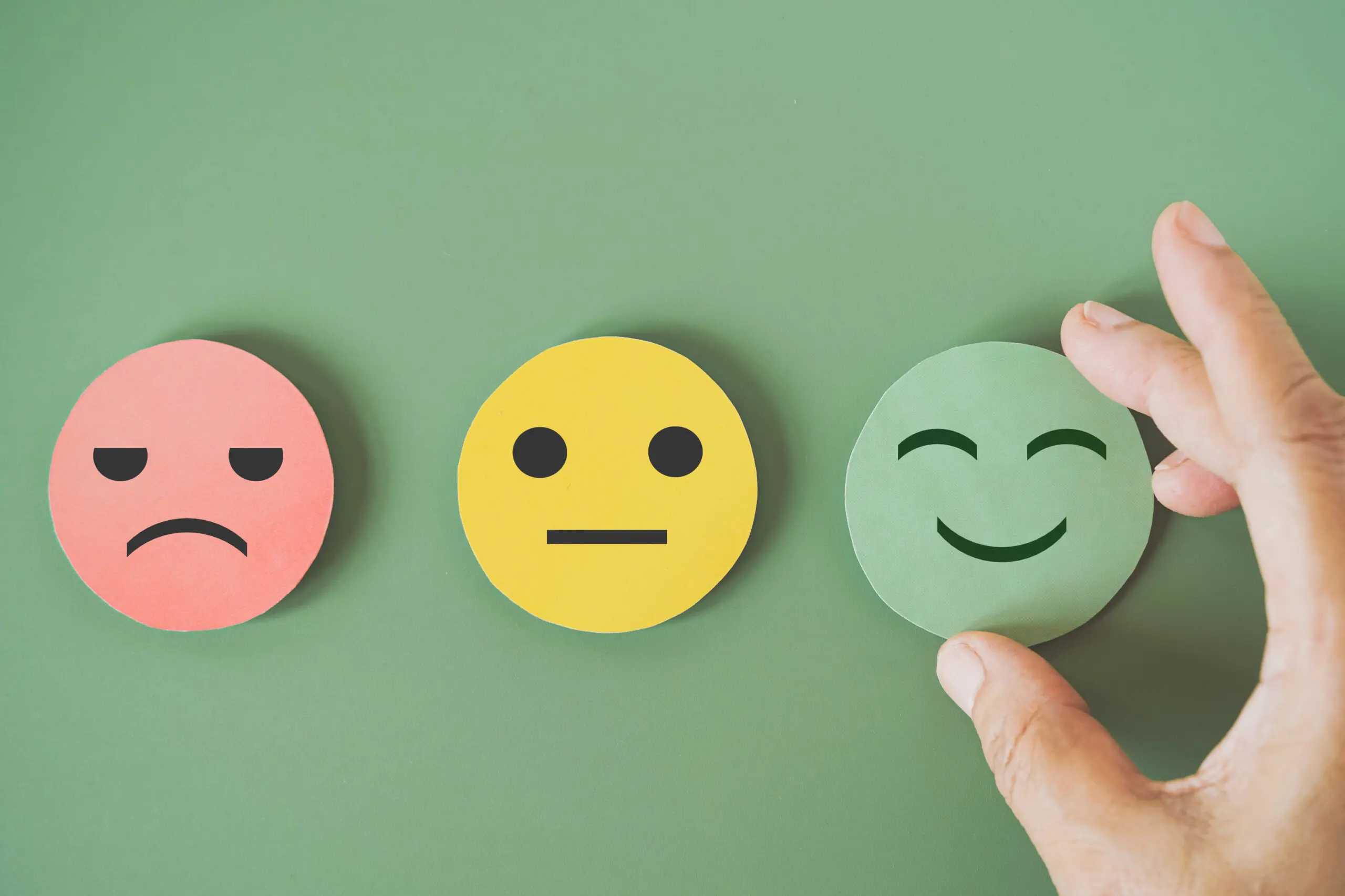
Don’t be the Next Victim of Bad Design: Avoid These Deadly Usability Traps
Spooky season is here, which means it’s time to prepare for the ghosts, monsters, and jump scares lurking around every corner.
We have all been there… sitting on the edge of the couch, practically screaming at the characters on the screen as they make one bad decision after another. Don’t go outside! Don’t open that door! Don’t go into the basement! As members of the audience, it is hard not to judge these poor souls for their seemingly obvious mistakes.
As human factors specialists, we often find ourselves in a similar situation. Watching a product development process unfold and wanting to yell, “Don’t do it!” when we see a team about to make a common usability mistake. Just like in a horror film, those small, seemingly harmless decisions can lead to disastrous outcomes.
So, in the spirit of survival, I have put together a Human Factors Guide to Surviving a Horror Film: a 10-step guide to help design teams avoid the most predictable (and deadly) usability mistakes. Think of it as your flashlight in the dark, assuming of course the switch was designed with the user in mind.
1. Never Use a Ouija Board to Get Answers
HF Translation: Don’t rely on vague feedback or intuition. Summoning spirits for guidance never ends well! And neither does relying solely on gut instinct. Data, not superstition, should drive your design decisions.
HF Recommendation: Use evidence-based methods such as task analysis, root cause analysis, and validation studies to uncover the truth.
2. Don’t Split Up
HF Translation: Teams that stick together survive. In horror movies, characters that split up rarely make it out alive. The same goes for product development; when engineering, human factors, clinical, and regulatory teams work independently of each other, the design suffers. Close collaboration keeps everyone on the same page and can prevent costly mistakes.
HF Recommendation: Keep your teams connected. Regular cross-functional check-ins and shared decision-making can help designs withstand the “monsters” of miscommunication and misalignment. Not every team can be as lucky as Scooby and the gang when splitting up and searching for clues. Most teams fare better by sticking together, because collaboration is your best defense.
3. Don’t Ignore the Monster Under the Bed
HF Translation: Hidden problems can sneak up on you. In many horror movies, there is something terrifying lurking under the bed, often going unnoticed until it’s too late. In design, the same is true for hidden usability problems, as the most critical issues are not always obvious at first glance. They can often hide in rare tasks or small parts of the workflow, and ignoring them can be disastrous.
HF Recommendation: Look in the “dark corners” of your product. Observe real users interacting with your product, test unusual scenarios, and check areas that seem simple or boring. Catch hidden problems before they become a nightmare.
4. Don’t Run Upstairs When Being Chased
HF Translation: Don’t make workflows harder than they need to be. Running upstairs only traps you further, just ask Michael Myers. The same happens in design when users are forced through illogical or inefficient paths.
HF Recommendation: Follow natural user behavior. Use journey mapping to map task flows on what users actually do, not what we would expect them to do or what’s easiest for us to create.
5. Don’t Assume It’s Over Just Because it Got Quiet
HF Translation: Just because your (formative or summative) study went well doesn’t mean that the danger is gone. The calm before the final jump scare gets me every time, and usually results in my popcorn flying everywhere. In design, that same false sense of security can strike after usability testing. Passing validation doesn’t mean perfection and that your work is finished. You should always remain vigilant and look for ways to improve your product throughout its life.
HF Recommendation: Keep monitoring usability post-launch. Iterations and vigilance will help prevent the sequel nobody wants.
6. Don’t Take the Shortcut Through the Graveyard
HF Translation: Rushing validation always ends badly. There is always at least one doomed character who thinks a shortcut through a sketchy place will save them time. Spoiler, it does not. A similar sentiment can be felt when design teams choose to rush or even skip testing altogether as a way to cut costs and save time. However, this typically always leads to bigger issues in the end.
HF Recommendation: Give your team the time and resources they need to do it right the first time. Survival favors the patient.
7. Don’t Bring Spirits Back from the Dead
HF Translation: Don’t resurrect outdated templates or legacy designs. Just because “it has always been that way” doesn’t mean it is safe or effective. Some designs should stay buried.
HF Recommendation: Re-evaluate legacy designs, interfaces, and processes with modern human factors principles. Don’t bring bad designs back to life.
8. Always Charge Your Phone
HF Translation: Always plan for reliability when it matters most. In horror movies, the phone always dies right when it is needed the most. In the real world, unreliable systems can be just as dangerous.
HF Recommendation: Design for dependability and resilience, not ideal conditions. Critical systems should never go dark. It is important to test for failures, build in redundancies, and plan for worst-case scenarios to ensure your device will work when users need it the most.
9. Don’t Go Into the Basement
HF Translation: Don’t expect users to fix the problems caused by poor design. In horror movies, there is always one character who picks the short straw and has to go into the basement to fix the breaker, and it rarely ends well for them. In real life, designing systems that require the user to troubleshoot failures is risky.
HF Recommendation: Create systems that are resilient and intuitive guide users safely even when things go wrong. Don’t leave them fumbling in the dark; anticipate problems and design solutions that keep them out of danger.
10. Don’t Ignore the Signs
HF Translation: If users need a sign to survive, make it impossible to miss. In horror movies, someone always ignores the signs that say to “Turn Back Now” and disaster tends to follow. In design, the same can happen when instructions, warnings, or labels are unclear. Many users won’t read the IFU, and to them the only thing scarier than an IFU is one that is confusing or impossible to follow.
HF Recommendation: Make instructions, important information, warnings, and alerts impossible to miss. Use bold visuals, simple language, and images to guide users. Step-by-step cues and in-device prompts help even IFU-skimmers survive the night.
Conclusion
In horror films, survival isn’t about luck. It’s about awareness, preparation, and learning from the mistakes of those who didn’t make it into the sequel. The same goes for design. Human factors gives teams the tools to anticipate danger, avoid predictable pitfalls, and keep the lights on when things get dark.
So as you navigate your next project, remember that the goal isn’t just to survive usability testing, it’s to make sure your users do too. After all, even the best-designed flashlight can’t save your life if the switch doesn’t work.
If you are still here and I have not scared you away yet, I would love to hear about any survival tips that you would add or any advice you would give for making sure good design lives to see another day.