
Have you ever wondered why the exit window buttons are often in the corner of the screen? Why is the brake pedal larger than the accelerator? Why keyboard keys on the outer edges are significantly larger than the letters in the middle? The answer is Fitts’s Law.
Here are the basics: Fitts’s Law says that the time required for a human to quickly (and successfully) move to a target area is a function of the ratio between the distance to the target and the size of the target itself. In other words, it will take you more time to successfully reach a target as the distance from the target increases and the size of the target decreases.
This is one of those laws that are fundamentally intuitive: “Well, yeah. I feel like I knew that already”. But only when we consider it explicitly can we leverage it in a design.
Fitts’s Law on YouTube
Fitts’s Law can be found everywhere. Look at the YouTube page of the video you most recently watched. If you don’t have one handy, this is pretty similar to what it would look like:
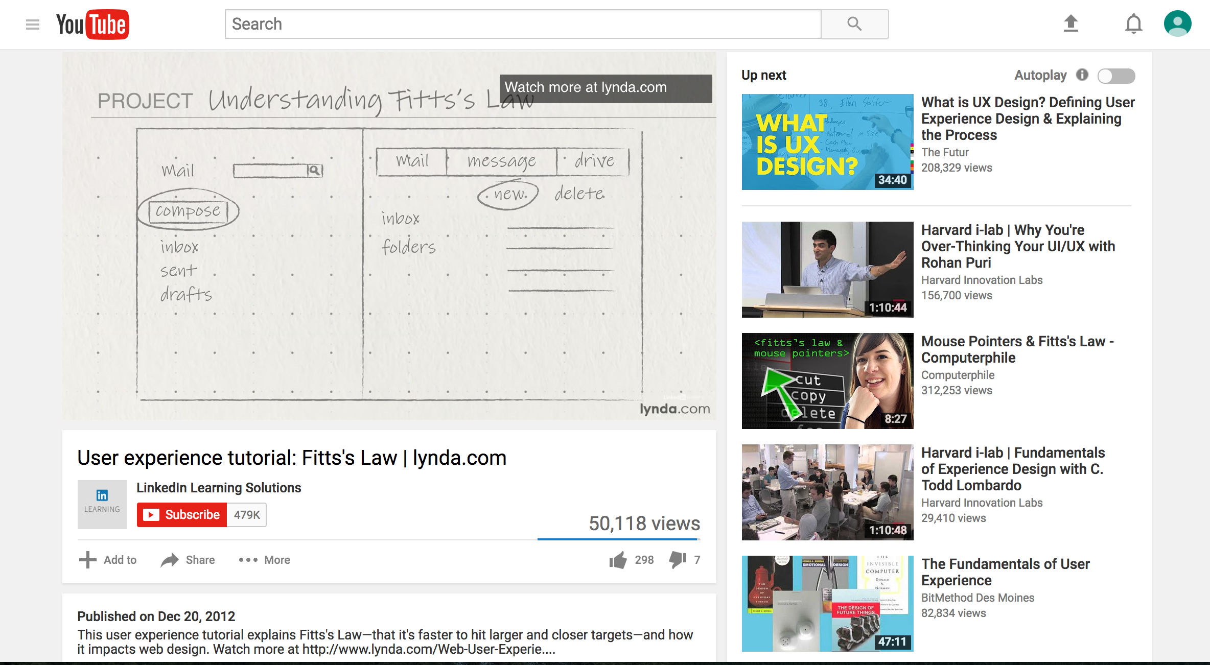
The video itself takes up about one-third of the page. Straightforward enough. But what else takes up another third of the page? Related videos! And each of those is huge! YouTube has made those “Up next” videos enormous because all they want is for us to keep watching. As far as YouTube is concerned, each related video is very important, so they are very big and very close to the focal point of the page.
Fitts’s Law in Keyboards
What about keyboards?

Our fingers are supposed to be at resting position along that central row. These buttons are nice and easy to key because they are nearby. But what happens when our fingers have to reach way out to the outer edges of the keyboard? The keys get bigger. The delete and enter/return keys, perhaps the most important buttons we use, are 150-200% larger than the middle keys. Fitts’s Law at work, ladies and gentlemen!
Fitts’s Law in Brake Pedals
Why is the brake pedal larger than the accelerator pedal?

To answer this question, we must consider the importance of each pedal. Of course, both are very important to drive a car. But, from a safety perspective, it is markedly more important to quickly and accurately locate the brake pedal than it is to locate the accelerator pedal. In the moments when it matters most (i.e., to avoid a collision), automobile manufucturers have created as large of a target as possible for drivers to hit.
Applying Fitts’s Law to Design
Remember, Fitts’s law tells us that users take more time to successfully reach a target as the distance form the target increases and the size of the target decreases. The farther away the target, the less accurate users will be in reaching that target. The smaller the target, the less accurate the users will be.
Fitts’s Law therefore guides us to:
- Important targets should be close by. Conversely, less important targets can be far away.
- Important targets should be larger. Conversely, less important targets can be smaller.
For example, consider a medical device with an emergency stop function. Given that it is important for users to press that button quickly and accurately, it should be near the user’s focus of attention and it should be large relative to other objects in the design.
For more resources on Medical Device Human Factors please check out our blog and YouTube channel.