Importance of Contrast to Human Factors and Accessibility
Revised in June 2018, The Web Content Accessibility Guidelines (WCAG) 2.1 is the main guideline for accessible design requirements. It describes everything related to the world of accessible design: closed-captioning details, time-related factors, alt-text, spacing, and of course, guidelines for successful contrast across the user interface.
The topic of contrast within the WCAG 2.1 is significant. In fact, the guidance document dedicates three sections to contrast in order to cover various design elements.
The present article introduces the concept of contrast at a basic level. It discusses the contrast-related sections of WCAG 2.1 regulations and provides real-world examples of good and bad contrast in digital design.
What is contrast?
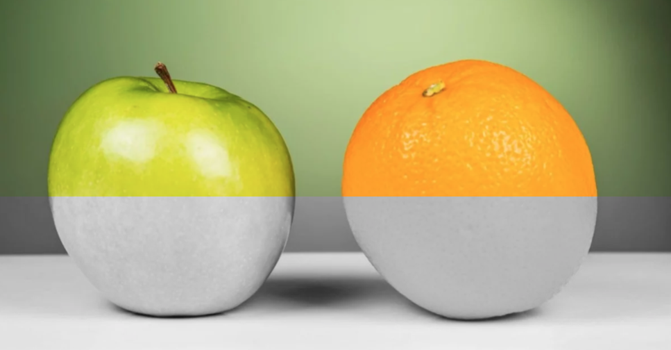
In simple terms, contrast is the difference in brightness between objects in our field of view. The image below demonstrates how similar a green apple and an (…orange…) orange can appear when only contrast is considered.
In the context of website or app contrast, the two objects being compared are objects in the “foreground” and stuff in the “background”.
The highest level of contrast possible occurs when background content is pure white and foreground content is pure black. Conversely, shades of foreground and background approaching one another lower the ratio.
How do we quantify “good” and “bad” contrast?
As noted above, contrast is not a standalone phenomenon, but rather a matter of comparison. Specifically, a comparison of the brightness between two objects. Because it is only definable as part of this comparison, the measurement that practitioners discuss most often is called the “contrast ratio”.
A “good” contrast ratio corresponds to a higher value, while a bad contrast ratio corresponds to a lower value.
It’s worth noting that the accessible design community has not reached a consensus on exactly how to measure contrast ratio. We encourage those that are interested to read up on this elsewhere, as these differences might be relevant to your application. However, most methods — at least for the majority of UX practitioners — produce *very* similar results for the level of fidelity and accuracy that you’ll need.
What are the levels of accessibility compliance within WCAG 2.1?
The WCAG 2.1 defines three levels of accessibility compliance: “A”, “AA”, and “AAA”. More “A’s” means better accessibility compliance. The single “A” represents the “basic” or “minimum” standard that designers and developers should meet. If you miss the mark here, even users with a low-level disability (e.g., early stages of macular degeneration or Parkinson’s disease) may struggle with the design.
WCAG’s “AA” level is the standard for accessible design compliance; it is increasingly used as the benchmark for accessible design. In the U.S., Section 508 of the Rehabilitation Act (revised) also uses “AA” as the standard level.
“AAA” is the ideal or optimal level of accessibility compliance possible, according to WCAG 2.1. Designs that meet this level of compliance are theoretically usable by the widest range of users with a disability.
One reason there are different levels is that it’s not always possible to create designs that consistently meet the highest level of accessibility compliance. The design of a product is inherently tied to changing contexts of use, interface size, interaction mode possibilities, user capabilities, and use scenarios. And, while there may be ways to improve to “AAA” compliant, it might cost the design (or the user) elsewhere to make it possible.
What does WCAG 2.1 say about contrast?
The WCAG 2.1 discusses the topic of contrast in accessible design in three sections. These sections include:
- 1.4.3: Contrast (Minimum) — i.e., “AA” level
- 1.4.6: Contrast (Enhanced) — i.e., “AAA” level
- 1.4.11: Non-text Contrast
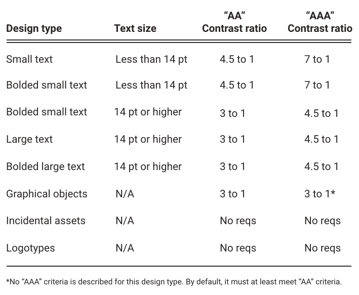
The table below highlights all of the criteria described in these three sections of the WCAG 2.1 guidance. To clarify, “graphical objects” refers to things like photos and other images. Meanwhile, “incidental assets” refers to design elements that are not actionable and are purely decoration.
Grayscale
Although our visual systems can detect approximately 10 million unique colors, its ability to tell one shade of gray apart from another is much more limited. Decades ago, experts believed humans could perceive many shades of gray. More recently, however, publications say humans only perceive about 30 unique shades of gray before the differences wash together (Kreit et al., 2012).
Furthermore, our ability to distinguish shades of gray diminish as the shades approach the extreme ends of black and white. In other words, we are worse at detecting differences between two very dark shades of gray, than we are at detecting differences between two medium shades of gray. This means that we need starker contrast differences to aid our perception in grayscale.
Bad contrast example: Mac’s calculator
Many designers and developers violate these rules of accessible grayscale contrast. And not just the small mom and pop shop designers, either. For example, Apple doesn’t design every product with the best contrast. This seems strange given the company’s strong advocacy for inclusive design; many users with a visual impairment hold Voice Over (iPhone’s screen reader) in high regard.
The MacOS (computer) version of the calculator app has the same design as the iOS (iPhone, iPad) calculator app. However, one use-related factor combined with one design-related factor can make the MacOS version inaccessible from a contrast perspective. Unlike the app-based calculator version, the computer version can be moved around the screen. This means the calculator’s background can change. Given that the top segment of the calculator has a subtle transparency in its design, this poses a major contrast issue.
These two factors combine to make the Apple calculator have poor contrast on stark white backgrounds. And when placed over darker backgrounds, it’s just OK.
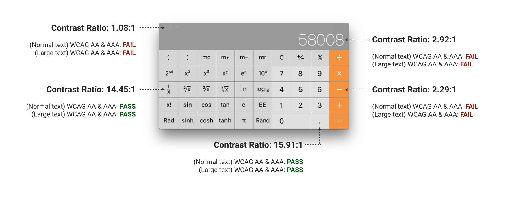
On a white background, the application’s exit, maximize, and minimize buttons in the top-left corner all but disappear (ratio = 1.08:1). Since the visual cues appear to be missing, this could frustrate Windows users. Even worse, the main display text also has poor contrast with the background as well (ratio = 2.92:1).
Lastly, white text on orange buttons offers poor contrast, regardless of background (ratio = 2.29:1). This is true in the app versions of the Apple calculator as well.
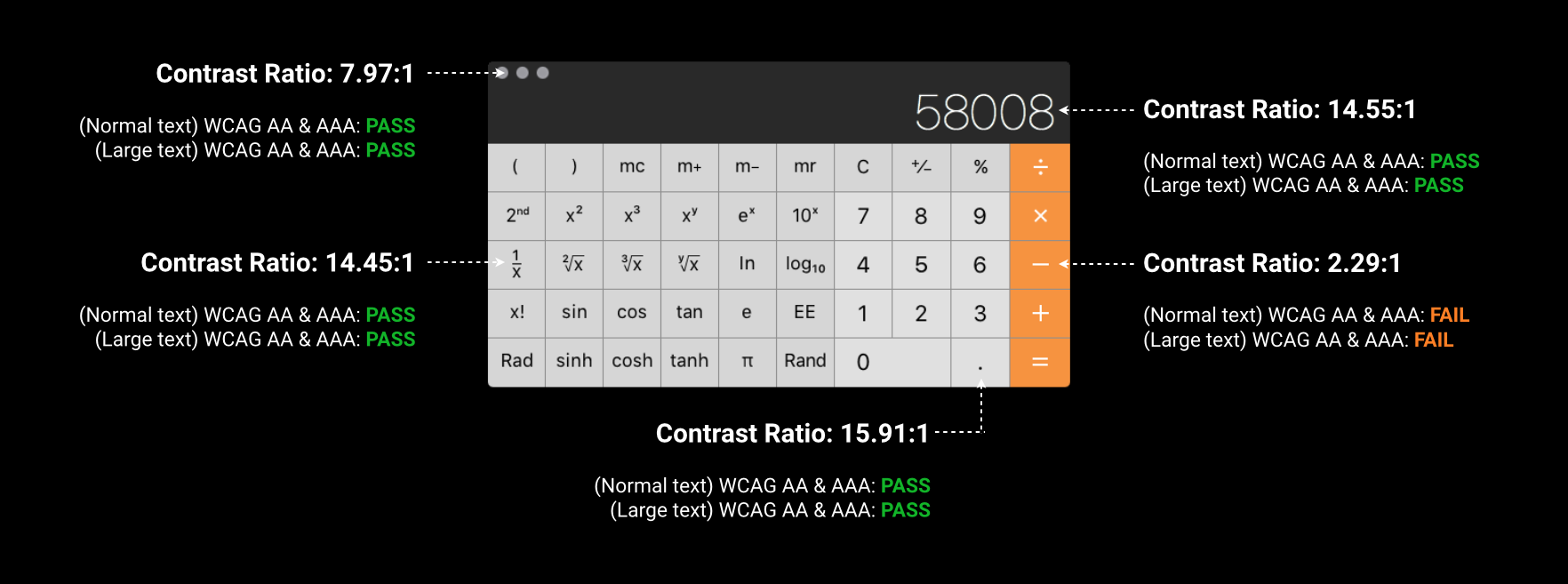
A few things improve when the calculator is placed on a black background. The calculator exit, maximize, and minimize buttons in the top-left corner are much more discoverable (ratio = 7.97:1). The main calculator display text jumps up considerably, too (ratio = 14.55:1).
A possible solution…
Apple doesn’t necessarily have to get rid of the transparency in their design. For example, they could incorporate a type of conditional design element based on the background color behind the calculator window; the design would be more transparent when placed over a dark background, and more opaque when placed over lighter backgrounds. All the while, contrast would remain predictable and accessible for users.
Bad (and good) example: iPhone’s airplane mode
A common design strategy to communicate that an asset is disabled/unavailable is to show it in a grayed-out state. This design strategy can present some challenges to users with low vision. Often, users with a visual impairment that affects their contrast perception cannot see an asset in a disabled, grayed-out state. The contrast is just too low. As a result, these users may not be aware that this particular feature is an option in the system.
As an example, think of the “airplane mode” feature on the iPhone’s swipe up menu (aka: Control Center). When airplane mode is turned off (i.e., disabled), the button is a transparent gray. When it’s turned on (i.e., enabled), the button turns orange and opaque.
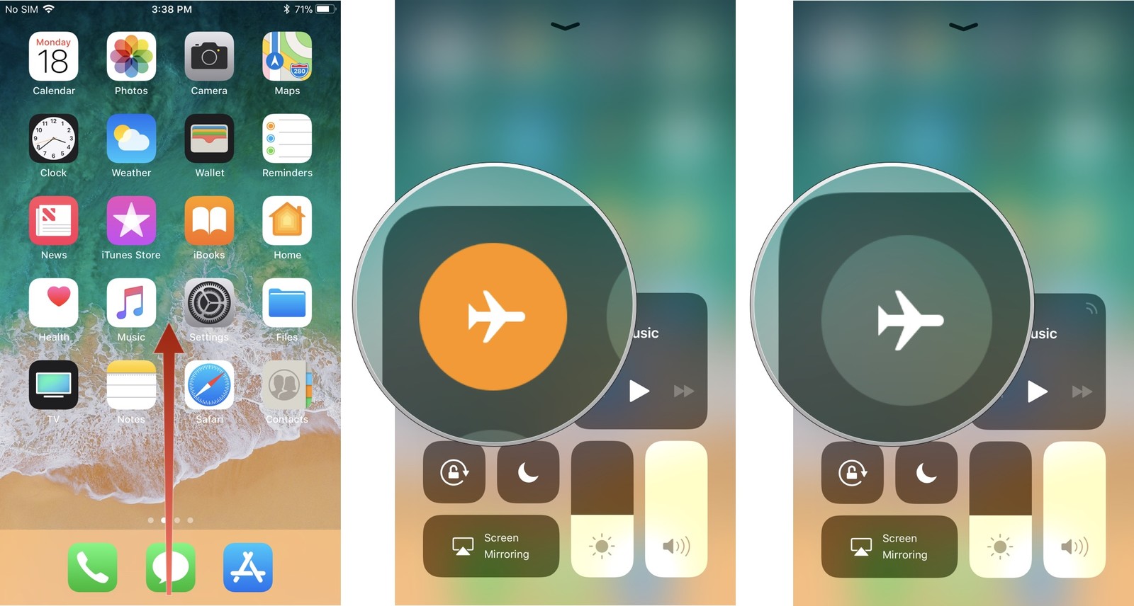
There are some surprising mistakes with this design.
On the positive side, the contrast ratio for the orange, enabled airplane mode button meets WGAC 2.1 “AAA” compliance. Unlike text, which requires higher ratios, graphical objects only need to have a 3:1 contrast ratio.
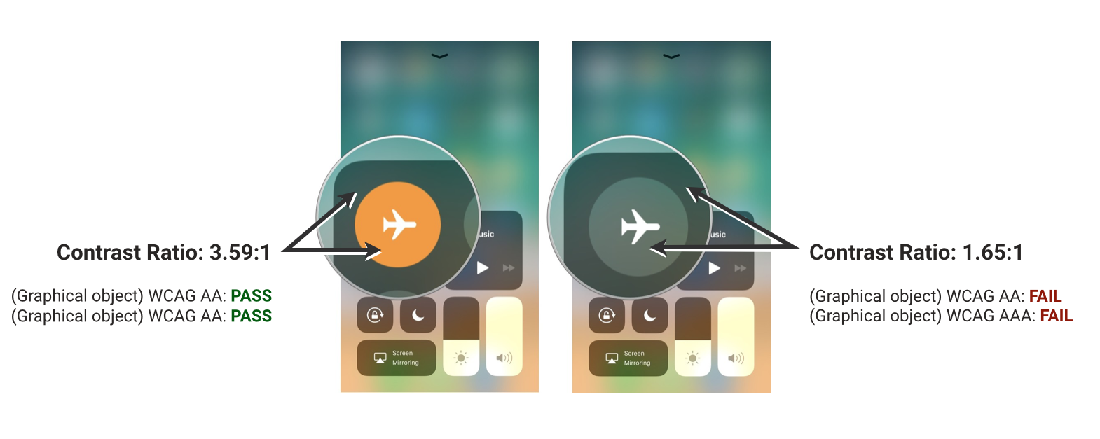
But, in the disabled state, the contrast ratio fails to meet even “AA” criteria. In fact, it falls way short of the mark at a ratio of only 1.65:1. Again, the user’s background influences the button’s transparent design. Had this user chosen a different background, the outcome might be a little different.
Apple’s design does find workarounds to this issue.
Although the button itself has poor contrast with the background, the stark white airplane icon in the middle of the button is far more discoverable. That’s because the airplane icon has decent ratio from the button itself (i.e., ratio of about 5:1).
Even if the user cannot perceive a difference between the button and the background, they might be able to tell the difference between the airplane icon and everything else in the background.
Final thoughts
There are many reasons why we allow poor contrast into our world of design. Some involve sheer unawareness of the impact of poor contrast. Others involve the desire to make your design stand apart from the black and white design world.
The fact of the matter is that contrast is one of the most fundamental elements of accessible design. It’s a big part of what makes assets in a design “perceivable” by users, disability or not. If you’re producing content that violates basic guidelines, stop and ask why. Sometimes just having the conversation with your team is enough to push them toward generating better, more accessible design.