What’s yellow, bedazzled in glass beads, and made out of plywood?
Believe it or not, we’re talking about the STOP sign. The red, reflective, octagonal traffic sign we see so often today did not always have these classic characteristics. This article explores the history of STOP sign designs and how human factors (vision & perception) and manufacturing processes affected design changes over time.
Start Your Engines
In the early years of the automotive industry, the motivation to own an automobile was born from the need to extend one’s efficiency in farming and business practice. A farmer equipped with horse and wagon could only travel a practical distance of 10 – 15 miles in a day. As a result, farmers beyond that distance from the city faced inherent transportation and business limitations. For the few farmers that possessed an automobile this technology only increased their mobility potential marginally. The net gain for these fortunate individuals meant the ability to sell to different marketplaces, expanding business potential and profitability.
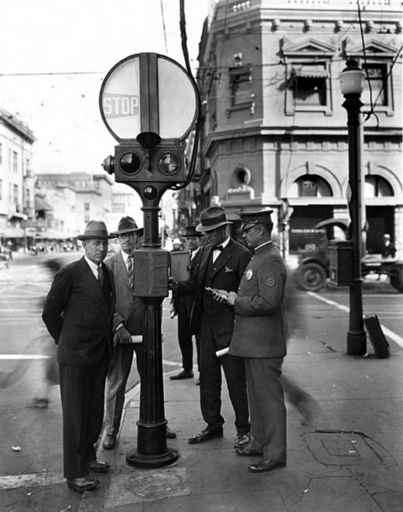
Due in part to monetary limitations, automotive clubs were responsible for the development and dissemination of the first traffic signs. Members would post signs, warnings, and notes to fellow motorists at various points on early roadways. Not surprisingly, since there was no clear standard for design or location, there was a lot of inconsistency and safety concerns.
In fact, according to the New York Times, a pioneering text responsible for introducing the notion of traffic signage was, Reforming Our Street Traffic Urgently Needed, written for a magazine called Rider and Driver. The author’s simple plea included placing stoppage signs at intersecting roadways.
This request came at a period in history where most roads were unkempt gravel or dirt, had no line markings, no standard travel speed, no designation between pedestrian and motorist areas, and no traffic lights (it wouldn’t be until 1914 that American Traffic Signal Company installed the United States’ first traffic light in Cleveland, Ohio.
Infinitely Idiotic: The Rationale for Shape
A key issue the Bureau of Public Roads faced was the fact that a large proportion of American motorists were relatively illiterate (U.S. Department of Transportation). This meant traffic signs had to be designed in ways that were universally understood, with or without the use of English words. Factors such as the shape, size, and color were of particular importance in these formative years of traffic sign design.
Over time, however, with increases in automotive production efficiency (i.e., assembly line) and material consistency, the automobile transformed into a financially viable option for many households by the early 1920s. Indeed, the Bureau of Public Roads recognized this rise in automobile popularity and sought a solution to the growing safety issues.
Engineers toyed with various STOP sign shapes. Based on little more than intuition and some feedback from railroad engineers, the Mississippi Valley Association of State Highway Departments decided that the number of sides a sign has would indicate its “danger level”. These Engineering-types perceived that it was common knowledge that the circle had the most number of sides — an infinite number, in fact. Thereafter, circular traffic signs denoted areas with the highest level of danger for motorists. Take a moment to appreciate the lunacy of that decision.
Over time, railway settings used exclusively circular signs. Whereas the octagonal shape of the STOP sign remained rooted in motorway settings.

The Rationale for Color
With the shape issue “resolved”, STOP sign designers then considered color. Surely red was the frontrunner. Alas, the Bureau of Public Roads began production of yellow STOP signs in 1915 in major automotive regions such as Detroit, Michigan (Moeur, 2010; http://www.trafficsign.us/yellowstop.html).
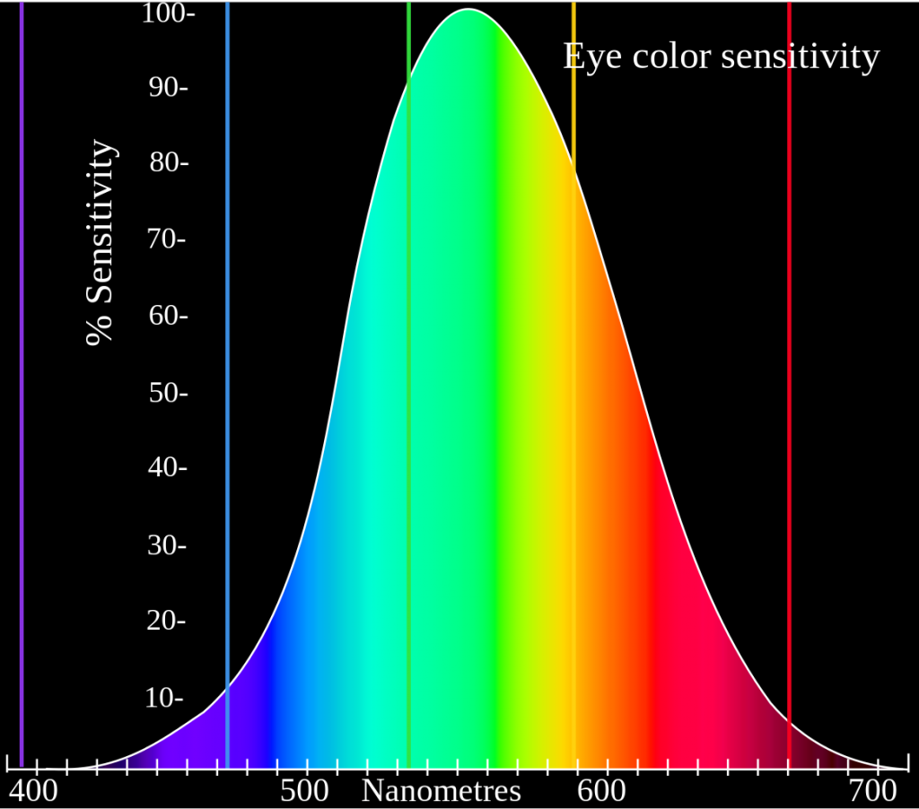
Why yellow? Pioneering research in early Human Factors and physiology had revealed that the human eye was most efficient at detecting colors within the yellow and green spectrum, especially when scotopic vision (i.e., high use of rods, low use of cones) is used in low light (e.g., dusk; night time). Despite common belief, red is not easily or quickly detected in low light conditions. In fact, the color red is almost impossible to discern at night without the assistance of an artificial light source (e.g., backlighting, headlights).
By 1924, all “warning”-type signs were produced in a standardized, bright yellow color. Likewise, all other signs were given a white background to differentiate the two categories of traffic signs: warning and informational. Both of these lighter colors provided the best degree of contrast (with black letters) in conditions with low light (e.g., nighttime, raining, fog) that manufacturing methods could produce at that time.
Yet problems persisted.
Despite their best efforts, the number of accidents and issues on the (deteriorating) roadways continued to increase from one year to the next. There were three central factors to this issue: a.) automobiles were being designed with greater power and speed potential; b.) more and more motorists were on the road; and, c.) headlamps and streetlights were not efficient enough to illuminate STOP signs on their own.
Headlamps at that time only offered about 100 ft. of illuminated distance in front of the automobile. However, today we know that your average (undistracted, unfatigued) motorist traveling at, say, 30 MPH requires approximately 115 ft. – 187 ft. of stopping distance, taking into account average brake reaction times. As a result, there simply wasn’t enough distance for them to react to an unfamiliar or unexpected STOP sign and respond appropriately if motorists traveled any faster than 30 MPH.
The need at this point in the evolution of the STOP sign design was to enhance its visibility and luminance.
Extending Our Sight
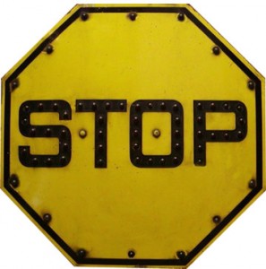
Experts considered multiple design strategies. The one that initially won during the 1930s was the incorporation of glass “beads” into traffic signs. Glass beads less than 1 inch in diameter were glued along the perimeter of the sign as well as along with the word, STOP. These beads incorporated an element of diffuse reflection which enhanced visibility at night when the motorist’s headlamps were on.
Unlike mirror reflection, diffuse reflection operates by “taking in” a source of light and distributing a portion of that light in all directions simultaneously. For example, the same way that a car’s paint reflects the sunlight during the day. The net effect of a diffuse reflective STOP sign was that it enhanced visibility by (about) an additional 50 ft. – 100 ft. at night.
However, the downside to this design approach was that it was inherently costly and time-consuming to produce. Reducing the cost and production time was a challenge.
By the late 1930s
Material scientists at 3M introduced a revolutionary retroreflective sheeting material that changed the STOP sign forever. Unlike the diffuse reflective beads, the retroreflective surface worked by “taking in” a source of light and reflecting a portion directly back.
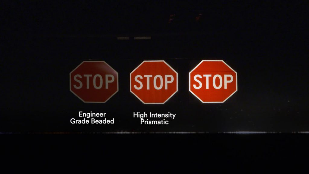
3M’s design, revolutionary as it was, wasn’t all that different than the glass bead approach. Like previous designs, they too used glass beads. However, the key difference was opting to crush the glass beads down to a slightly larger than sand-sized level. Afterward, the crushed glass material used resin to adhere to the entire face of the STOP sign.
This design approach worked — for a few years. Yes, it did indeed enhance the visibility of the STOP sign in comparison to the glass bead approach. And yes, it was (a little) cheaper to produce. However, the rough surface of the STOP signs quickly collected dust, dirt, and debris. Over time, STOP signs took on a dirty, dull appearance — which reduced their visibility to some extent. Likewise, during inclement weather, moisture would cling to the STOP sign’s surface, making it challenging to read.
The issue resolved within a few years by covering the STOP sign with a transparent, smooth film. This solution offered the best of both worlds: transparency, which allowed the STOP sign to retain all of its retroreflective properties and the smooth surface eliminated the accumulation of dirt and moisture.
The industry refers to this type of sheeting as “flat-top sheeting” — also known as “engineering grade sheeting”. It offers an enhanced viewing distance of up to 500 ft. for motorists. Engineering grade sheeting is still in production and used in environments with light traffic and lower speeds.
Seeing Red
To recap: 1940 – 1950s, all new STOP signs produced for use in the United States had the following properties:
- Octagonal shape
- Yellow background color
- Black “stop” text
- Black border (inlaid slightly from the perimeter)
- Retroreflective material (viewable up to 500 ft.)
So, when (and why) did the STOP sign turn red?
In 1954, a big decision was made about traffic signs. Many signs on the roadways were yellow. As described earlier, yellow traffic signs indicated some form of warning or caution to motorists. But there are tons of things that motorists have to be cautious of while driving. For example, “SLOW”, pedestrian crossing, traffic light ahead, “DIP”, “NO OUTLET”, “STREET CLOSED”, “DEAD END”, deer crossing, construction ahead, etc…
Bear in mind, the list of traffic signs was much, much shorter in the 1950s than it is today, but you get the point. Dozens of signs. All yellow. All black text. It gets confusing. And confusion on the roadway is a precursor for accidents.

The STOP sign seemed to become red almost overnight. According to revisions made to the Manual on Uniform Traffic Control Devices in 1954, the STOP sign should be “red” with “white letters”, which followed similar practices and color-coding systems adopted by traffic signals and railroads.
According to a New York Times interview with Professor Gene Hawkins from Texas A&M University, “red” has always been associated with the idea of “stopping” (Greenbaum & Rubinstein, 2011: http://www.nytimes.com/2011/12/11/magazine/stop-sign.html?_r=0). After all, red had been used at traffic lights for the same purposes for nearly 40 years. Implicitly too, the color red has strong associations with themes such as “danger”, “blood”, and “bad” — all things that potentially stem from choosing to run a STOP sign. But if this were the case, why didn’t the STOP sign switch over to red sooner?
The issue was production.
The color yellow wears quite well in heavy traffic environments with rocks and sleet and sunlight and exhaust and rain. Red, on the other hand, degraded too quickly; signs would have had to be replaced (which adds to cost, time, etc.).
Early red STOP signs are a testament to this issue. Even after guidance from the Manual of Uniform Traffic Control Devices, manufacturers still weren’t quite sure how to color the sign in a red that would resist fading and slow, but gradual wear. As a result, it would still be a couple more years until STOP sign manufacturers got the “recipe right” for the red color they needed.
To help you keep perspective on all of this — consider the following.
These design iterations came about almost a decade before many of today’s government agencies and organizations aimed at traffic control were firmly established. For instance, the National Highway Traffic Safety Administration (NHTSA) didn’t exist until 1970, when it was introduced as an offshoot of the Highway Safety Act. Yet even at this point in history, engineers, scientists, and motorists understood the need to promote safety on the roadway.
STOP Sign Design Considerations for the Future
Today, we face new challenges in STOP sign design. According to Retting, Weinstein, & Solomon (2003), there are approximately 700,000 police-reported motor vehicle crashes each year at STOP signs. Furthermore, approximately one-third of these reports involved one or more injured motorists or passengers (Retting et al., 2003).
To compete with these challenges, new STOP sign design concepts have begun to see production in high-risk areas (e.g., school zones, heavy pedestrian traffic). For instance, STOP signs with LEDs at the perimeter of the sign have begun to be incorporated into intersections with high-risk for driver distraction. Areas with busy downtowns, increased nightlife activity, and heavy pedestrian traffic are ripe for these types of STOP signs because they stand out better amongst flashing lights from advertisements and the constant battery of headlights and taillights.
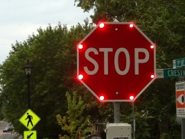
However, as more technology is incorporated into the STOP sign design, the cost of production increases as well. Indeed, these high-visibility, LED STOP signs cost approximately $450 per sign to produce. Compare that to your standard STOP sign, which usually costs less than $100 per sign.
Beyond technological consideration, there are several dilemmas that need to be better understood by Human Factors Engineers, Sociologists, and Traffic Scientists. As one example of these dilemmas, imagine people in your neighborhood are unhappy with the number of motorists speeding down your roads. Through a lot of effort, they get a petition signed by local residents and have a couple STOP signs installed at key intersections to slow things down.
Problem solved, right?
Well, no. Just the opposite, in fact. Numerous studies from the Institute of Transportation Engineers have demonstrated that having an excessive amount of STOP signs in a residential neighborhood can lead to increased speeding behavior. The reasoning? When motorists come to a full stop, they attempt to make up for “lost time” by speeding between signs. Especially when motorists are familiar with the road.
Detour: if you think well-placed speed humps would work better than STOP signs, you might want to think again. While speed humps and other traffic calming measures do lead to slower vehicle speed during ingress of the speed hump (Johnson & Nedzesky, 2004), motorists are likely to “compensate” after egress by speeding up considerably.
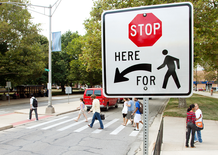
This is one of the assortment of dilemmas regarding STOP sign design that we must resolve in the future. Topics such as promoting safety, awareness, and compliance are areas that Human Factors Engineers can play a part in. Understanding how and why motorists interpret and respond to STOP signs in various contexts, driving conditions, and social environments will be challenging, and a critical piece of the puzzle to solve prior to making informed, smart design recommendations.
For more resources on Medical Device Human Factors please check out our blog and YouTube channel.


