Top-down and Bottom-up Cues: Using Perceptual Process in Injection Device Designs
Human Factors Engineers are often intrigued by peoples’ candid reactions to new devices. Recently, my friend received a new medication that needed to be administered via an injection device. While discussing it, they recounted familiar anecdotes about confusion, apprehension, and overwhelm that we hear in usability testing; participants will even finish their session with a remark like, “I hope I never need to do this!” Injecting yourself can be nerve-wracking, even for the most experienced self-injectors, but there are design considerations that can be incorporated to, hopefully, make for a less stressful process.
Prescription Injection Devices
Injection devices have become integral to patient at-home healthcare. Injections that were once administered in doctor’s offices can now be performed at home, saving the patient substantial time and inconvenience. Unfortunately, injections can also cause anxiety. Patients wonder, “Will it hurt?” “How do I know I did it correctly?”, and “What happens if I don’t do it correctly?” Proper design can address at least some of these issues and thereby improve the patient’s user experience.
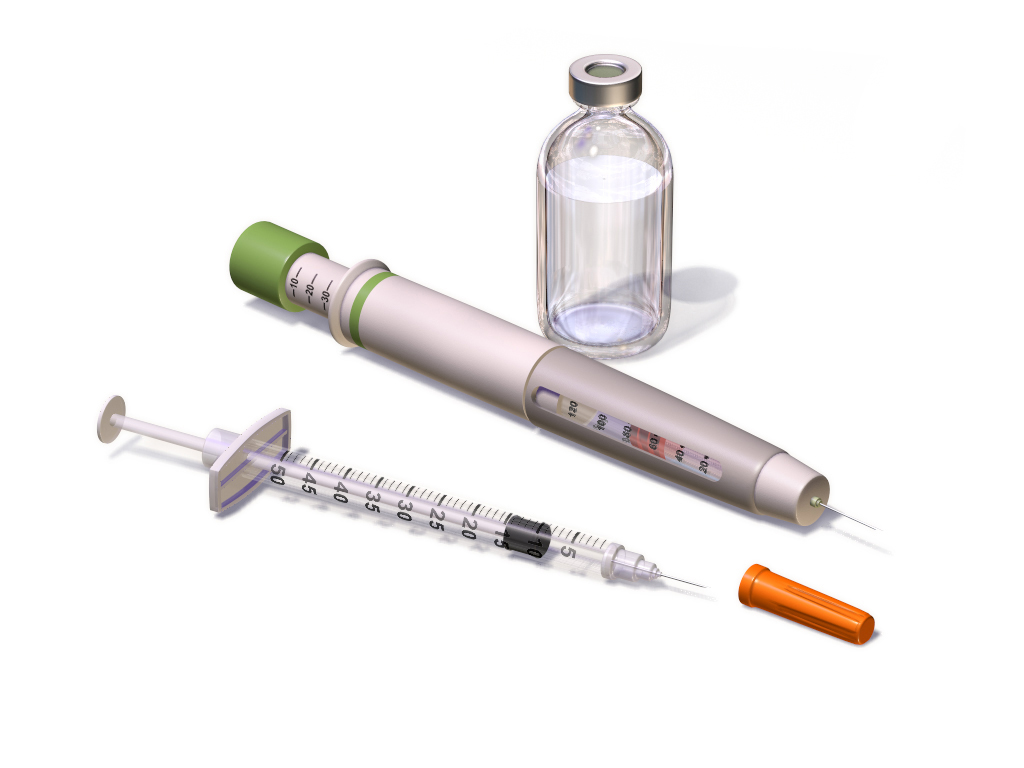
Image Credit: Blausen.com staff (2014). “Medical gallery of Blausen Medical 2014”. WikiJournal of Medicine 1 (2). DOI:10.15347/wjm/2014.010. ISSN 2002-4436.
Human Perception
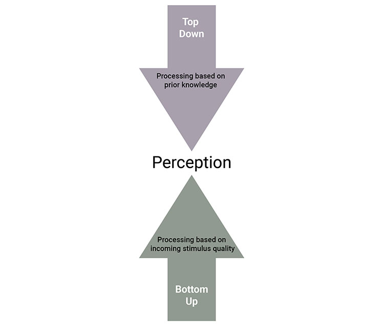
The cognitive process that enables us to recognize device components and understand what can be done is called perception. There are two types of perceptual processing, and both must be considered in design. In bottom-up processing, the brain analyzes basic sensory information such as color, shape, contrast, and sound. For the most part, this is automatic, occurring without conscious effort. We can facilitate bottom-up perception by ensuring that important components such as labels and icons are conspicuous enough to be noticed. We do this by designing those components to be of adequate size and visual contrast.
For example, a patient may remove a cap on an injection device and fail to notice a second, small, clear cap covering the needle, leading them to inject the medicine with the cap still on and wasting the dose. Instead, we could provide a larger opaque cap to draw the user’s attention and cue them to remove it before use. Bottom-up cues could save the day!
Conversely, top-down processing refers to how our knowledge and expectations guide our behavior. For example, based on previous experience or knowledge, we often expect to find a cap on an injection device that we know must be removed before using. This expectation prevents us from injecting the medicine with the cap on.
Source: Humanizing Healthcare (Branaghan, et al., 2021)
Applying Top-Down and Bottom-Up Cues to the Injection Process
Let’s consider how the bottom-up and top-down framework applies to injection devices. Bottom-up processing requires distinct and clear markings that even patients with low vision can see. For example, mL or mg markings should be large and provide enough contrast so the patient can draw up and confirm the correct amount of medication.
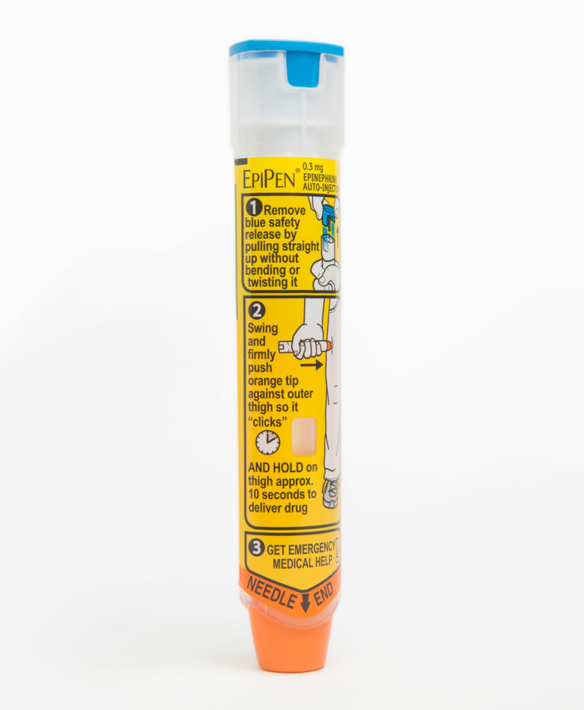
Design for top-down processing, however, can be trickier. In a recent usability study, we observed participants incorrectly attempt to inject into their upper arm rather than into their leg. This was simply because they had previously seen healthcare providers inject into their arm (e.g., the COVID-19 vaccine or a flu shot). This exemplifies a specific type of top-down processing called negative transfer – previous experience with one device created an incorrect expectation of how to use this new device. When users’ expectations do not align with correct use, there can be dangerous consequences Potentially, this problem could be mitigated by a label showing where the user can inject and/or how to hold the device as shown below.
Instructions for Use
We can also apply these perceptual principles to the design of instruction for use (IFU). Important information should stand out from the surrounding text by using a bold typeface, a larger font size, or a different font color. Here are some bottom-up examples.
- Safety critical information can be printed as bullets in a bold typeface beneath a paragraph of text, so it stands out.
- Color can also be used to differentiate steps from one another. Adding borders of varying colors can distinguish different steps, sections, or sub-sections.
- Warning or caution statements can be highlighted. Patients report that they associate bold typeface, red or yellow font colors, and caution symbols as important. On the other hand, these cues should be used sparingly rather than all at once to reduce clutter.
Examples of top-down design include:
- Ensuring that the order of steps in the IFU reflect the order in which they will be performed on the device. For example, If the user is required to handle the device with clean hands, hand washing should precede device removal.
- Steps that have sub-steps should be grouped and formatted with sub-bullets.
- Users should be able to find content easily in the IFU. That is, information should be in sections where users expect to find it.
Packaging
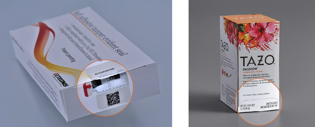
Do not forget packaging. Easy-to-open packaging can set the tone for the entire user experience. Patients sometimes tear open unfamiliar packaging that is difficult to open. In doing so, they may ruin important parts of the packaging such as storage or dose information. For this reason, it is important to guide the patient with bottom-up and top-down cues.
- A bottom-up cue may be a large, brightly colored arrow that says, “open here”.
- A top-down cue may be a perforation in the carton to press-to-open like a tea carton.
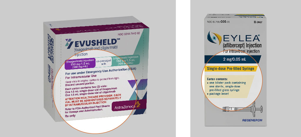
Finally, we must consider labeling which can help distinguish one medication from another. Bottom-up cues might include color, high contrast, and a large typeface to highlight critical information, whereas top-down processing requires us to place the name of the medication and the dose on the front of the carton, rather than on the side. Other information on the front of the carton should include: the medication name, dose strength, type of injection device (e.g., an autoinjector (AI), injection pen, or a pre-filled syringe), and the quantity included.
Conclusion
This is a lot to consider for such a small device, but the implications for patients are critical. By designing with top-down and bottom-up cues in mind, you can help create a more positive and safer user experience.
Contact us to learn more about how our Human Factors experts can help incorporate perceptual processes into your medical device design.
References
Branaghan, R. J., O’Brian, J. S., Hildebrand, E. A., & Foster, L. B. (2021). Humanizing Healthcare: Human Factors for Medical Device Design. Springer.


